Coronavirus map revolution
Recently we released a map that can dynamically show the trend of Coronavirus disease 2019 (COVID-19) epidemics:
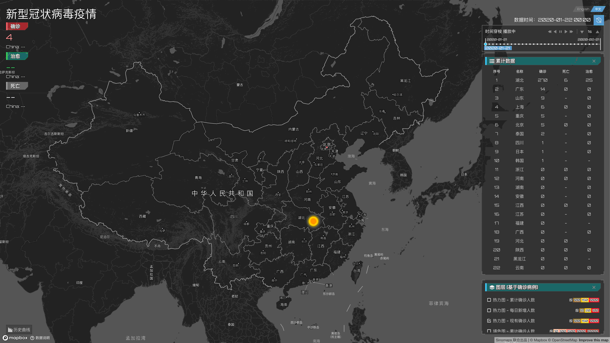
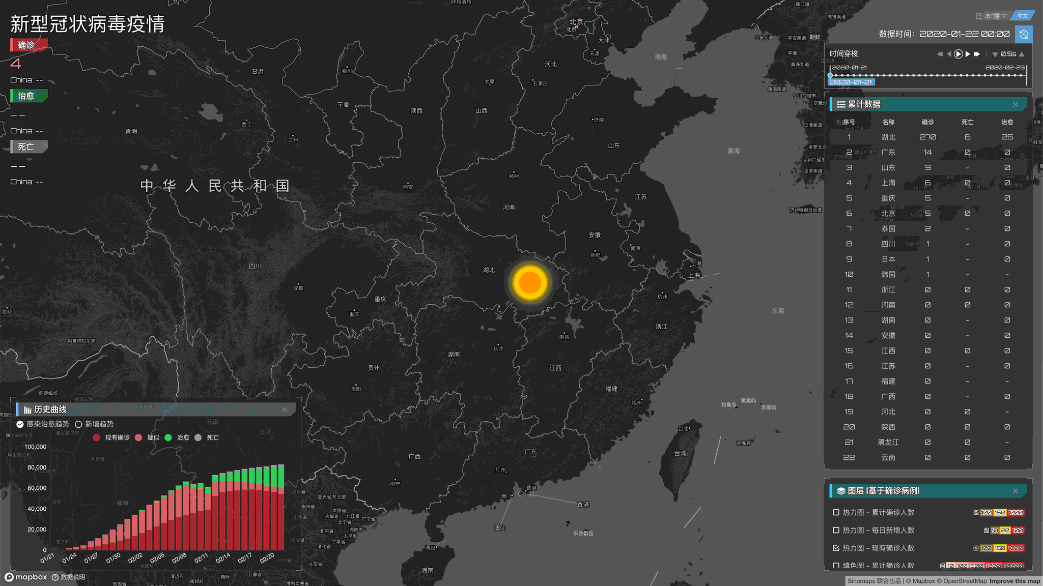
https://www.mapbox.cn/coronavirusmap/
Combined with the collision of inspiration from the East and the West, this map has iterated through many versions, and finally, we have the current version. We've published several official articles, and today as the developer, I'd like to talk about the story behind the development of this map: what we want to express through the map and what technical solutions we use to make the epidemic map come true.
Origin-initial version
The story begins during the Spring Festival self-segregation at home. After receiving a call from the boss C & F from the other side of the ocean, we decided to simply make a map that can reflect the development trend of the epidemic. But at that time, we don't know what we need to make and what kind of story we need to express through the map. What we can do is be brave!
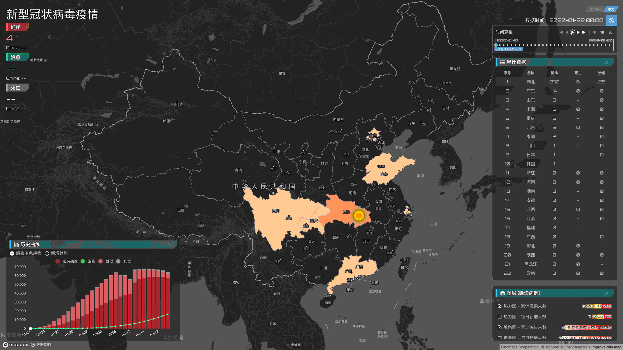
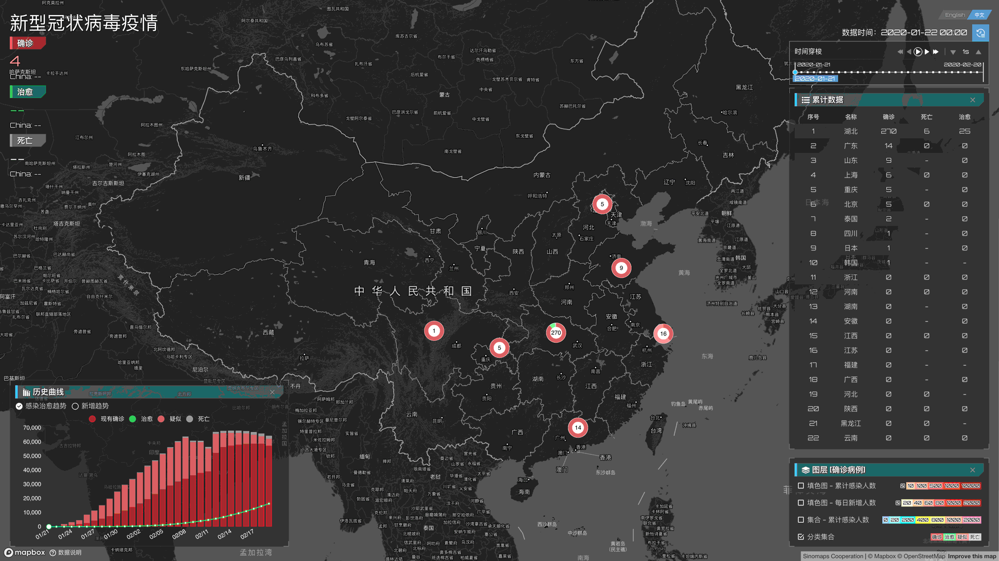
The initial heat map
When it comes to keywords like "trend", "development", the first thing that comes to mind is the heat map! So I went on for a night and got our first version:

Now it seems that our first version is a bit rough: We "randomly" put together several panels which a time control component. But the time control component takes me a little time to build(But, after we were going online, some colleagues said that he couldn't look away from our dashboard, and asked me what library we use for the time picker/slider. I was so ecstatic and said in my heart, "I didn't use any third-party library for this, I created it by hand!"). The map also stacked with an original heatmap (without too much carefully adjusted). That is our first version, I thought that would be enough to submit, but after a lot of discussions with the co-producer, there was a sudden opening, and everyone reached an agreement. "The expression of data is not just a heat map. We can do more. We can make data more powerful! ".
Data can be more powerful
The same data can bring different information to people according to various forms of presentation. Just like we usually use pie charts to express proportions and line charts to express trends, choosing the right expression can bring audiences different feelings. Of course, maps can also do this! So we introduced the concept of layers in this thematic map. We decided to let visitors see different things with different display effects: When you are concerned about how the epidemic spreads, then please open the heat map. When you want to look at the comparison between different provinces, please open the color fill map. When you want to see which city has the highest healing power, please open the category collection map. Another way to think about it, after the data is processed, we can also analyze it in different dimensions. For example, we can divide the data into a cumulative number, increase the number, existing number, etc. Each dimension can express a different story. The cumulative number can tell us the severity of the increase, the daily increase can let us see the development of epidemics in different places, and the existing number can tell us that victory is not far ahead!
As a result, we made the following improvements:
Improved graph
In the old version, our graphs, like most graphs on the Internet, "violent" put diagnosis, cure, suspect, and death on a line chart:
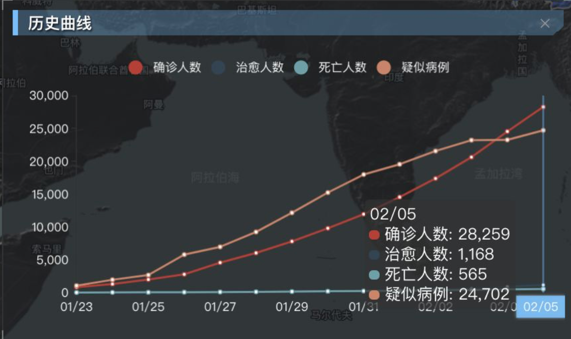
However, through this cumulative population chart, we can only see that the various lines are constantly increasing until these curves remain at a specific value and do not increase until the end of the epidemic. And we want to let the audience see more information. Not only can we see the trend of virus expansion, but also the information behind the data. So we changed the polyline to a stacking chart, a chart can express the current diagnosis, suspected, cured, and dead at one time.
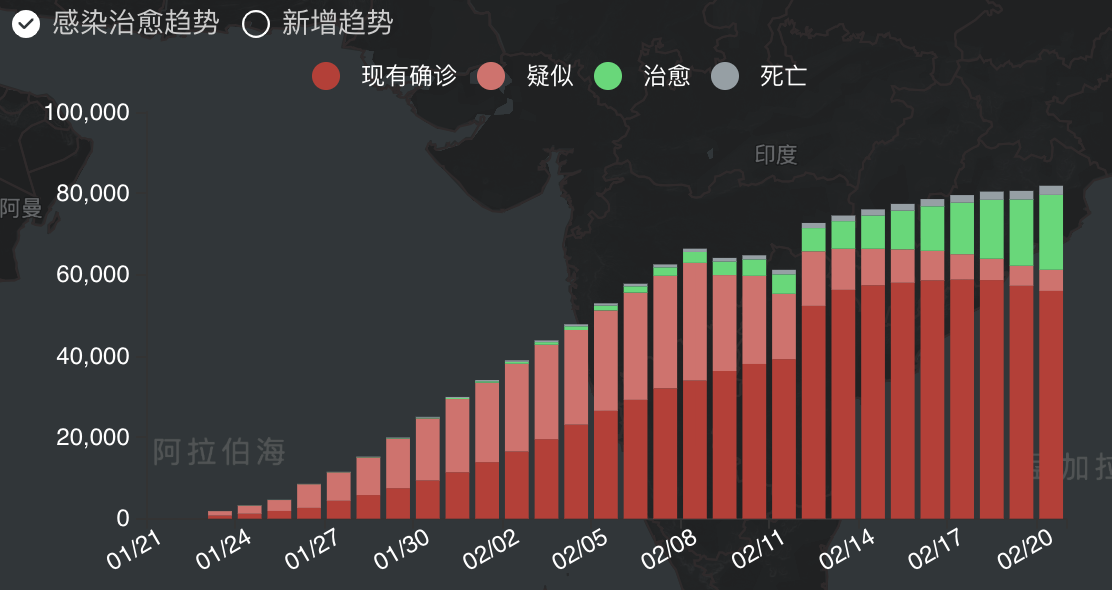
Through this chart, we can see the proportion of the classification of various states. With the continuous implementation of effective measures, we can see that the green area that expresses the number of cures continues to expand, and the red zone that shows the number of diagnoses continues to decrease. We can see from it with the investment in medical technology. The number of suspects has become less and less. We look forward to the near future in which green completely covers red!
Related Links:
Here we are using Apache ECharts to implement line and stack charts. The official website link is as follows:
- Apache ECharts https://www.echartsjs.com/
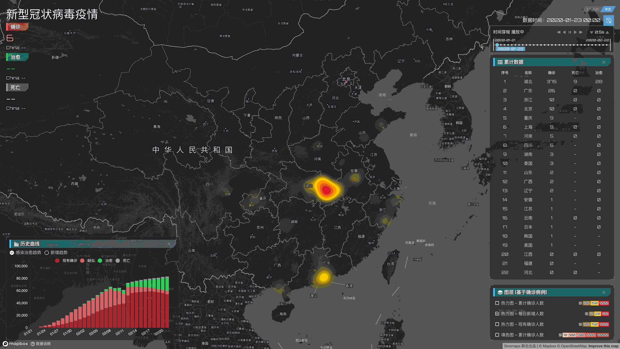
Improved heat map
Since the first version of the heat map used default configuration parameters, we found a few issues:
- Areas with low numbers of outbreaks are not natural to see because of little transparency
- The color mix is relatively monotonous
- The threshold configuration is not particularly reasonable, and the transition between the number of people is not particularly obvious
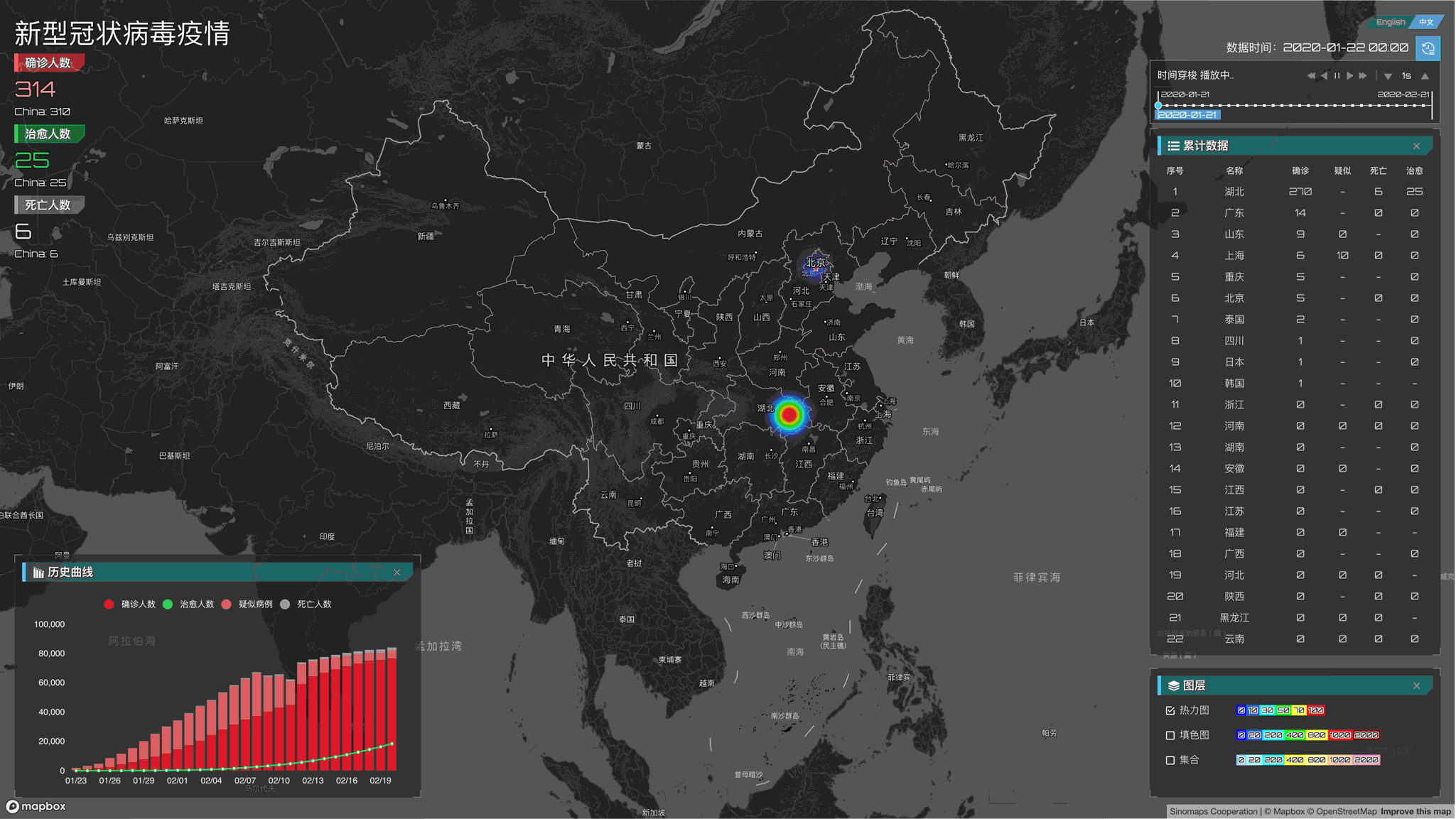
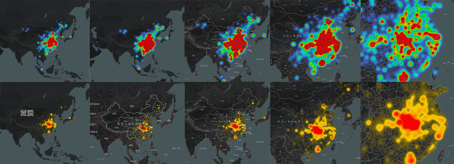
So we adjusted the heat map: first, we increased the transparency of the heat map in low-value areas so that not easy to detect the small increases through the heat map. Then we adjusted the threshold of the transition color. From the data, we can see that the values in the entire list are not linearly distributed. For example, the value of the first place on a certain day is more than 60,000, and the second and subsequent ones are in the range of several hundred to one thousand, which means that when designing the threshold, we must focus on the data range of 0.01-0.0001 (where 0.01 is the position of 1000 relative to 60,000, and 0.0001 is about 6 relative to 60,000 Position) focusing on adjusting this part of the value can make the thermal transition more soft and clear. So we have such a modified heat map:
When we were complacent, the revised style got the spit of some design professionals. In an internal memo, colleagues even wrote a long page to explain the color matching of the heat map. This is hard for non-professional designers like me, but there is no way I only can deal with it bit by bit. Fortunately, I have given a lot of useful links in the article and read it as a study one by one. After reading it, it is mainly divided into the following issues:
1. Thermal distortion
The thermal conditions of the data are distorted, especially when the zoom level of the map is small, and it seems that the entire east of China is infected.
Hmmm, This may be a relatively easy problem in the heat map. If you know the principle of the heat map, it is easy to understand why this happens: Generally, we use a certain radius in the drawing process. A semi-transparent circular fill color represents each point. During the drawing process, all points are drawn together according to the weight. The color of the place where the circle is drawn will be darker and darker so that you can get a graph that reflects trends. Take this picture and recolor it according to the darker depth of each pixel to get a heat map. If we keep drawing at the same radius at different zoom levels, the thermal power will be "amplified" (Imagine a 10px circle. At the 18 level of the map, the circle may be only cover one building, but when zooming let's say zoom 2, the circle may be larger than a province).
Fortunately, Mapbox's official heat map can accurately control some subtle parameters such as the radius, weight, and transparency of the heat map. We try to re-match the drawing parameters of different zoom levels to improve the readability of the overall heat map.
Related Links:
Mapbox GL JS provides official heatmap layers, and details such as color,intensity, opacity,radius, and weight are available, Combining Expression can easily achieve under different zoom levels the map smoothly switch to different parameter values, which can be viewed through the following links:
- Mapbox GL JS - Heatmap https://docs.mapbox.com/mapbox-gl-js/style-spec/layers/#heatmap
2. Color matching issues
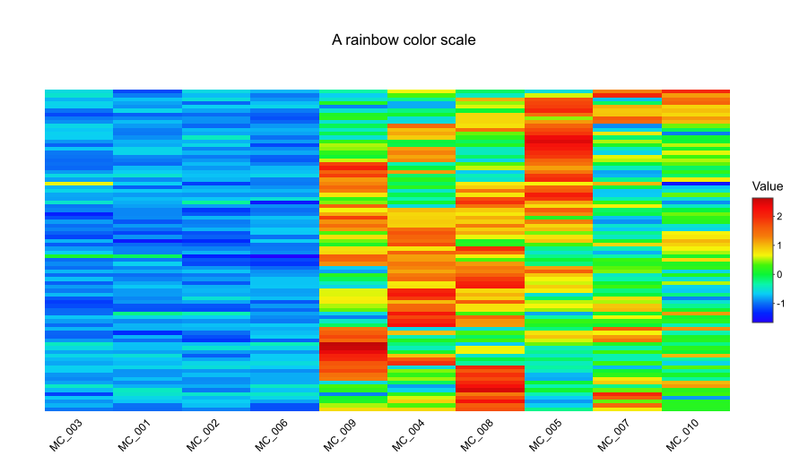
Rainbow colors
Rainbow colors are the most common heatmap colors. This color is really attractive compared to the single color, but this color is easy to be misunderstood. It may not be a good idea for visualization. The main reasons are: 1. People think of the brightest color as the maximum value, and different people have different perceptions about it: Some people think that orange is the brightest, and some people think that yellow is the brightest, so it is easy to cause misunderstanding. 2. The color change is not smooth, as shown in the figure below, comparing the color difference between orange (value 1) and red (value 3) is 2(3-1 = 2), and the color difference between blue (value 1) and green(value 0.8) is 0.2(1-0.8 = 0.2), many people think that the difference from orange to red (2) is relatively small, while the change from blue to green (0.2) is relatively large, but in fact, the opposite is exact.
Related Links:
The following link gives some suggestions on how to do the heatmap color matching and what should not be done, for reference:
- Dos and don’ts for a heatmap color scale https://blog.bioturing.com/2018/09/24/heatmap-color-scale/
Color-Blind-Friendly and color scheme
What ?! Color-Blind? To be honest, as a programmer, I usually rarely consider the feelings of this during the development process, but since my colleagues raised this issue very seriously, let's do some research. It is said that 8% of men and 0.5% of women see different colors scheme from most people. For example, for the two pictures below, the pie chart on the left is a full-color chart, and the pie chart on the right is a color-blind vision. Compare with most people. The color-blind image has a lot less color than normal color vision. Under this, when looking at the two bars in the lower-left corner, some people may not be able to distinguish the difference between the colors of the first two blocks. If we pay attention to this during the development process, we can let color-blind also distinguish different color patches by re-arranging the colors (bottom right).
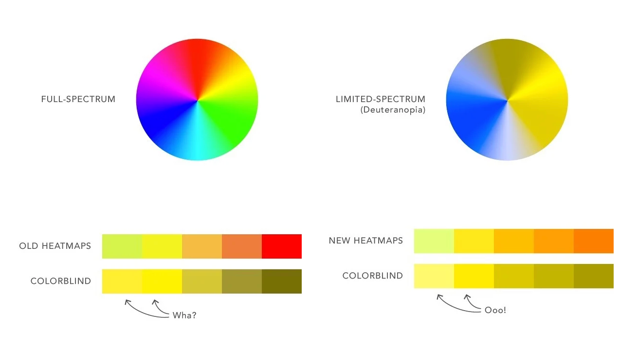
The problem of Color-Blind is solved, and the rest is the problem of color scheme, but how to use the correct color scheme is slightly more difficult for me as a "layman." After researching several articles, we decided to adopt a "meaningful" color scheme. Which means that the color scheme must be related to the subject. For example, if you want to make a heat map representing extreme cold weather, you can use a cool gradient (such as light blue to dark blue) to express it. If you want to express the plants' coverage, you can use different shades of green as your color scheme. Based on this conclusion, for the epidemic situation, I finally chose the yellow gradient that mainly represents an early warning, supplemented by the red that indicates danger, as the most serious indication, and finally adjusted the following heat map:
Related Links:
Designing Color-Blind-Friendly Heatmaps https://wistia.com/learn/culture/heatmaps-for-colorblindness
Finding the Right Color Palettes for Data Visualizations https://blog.graphiq.com/finding-the-right-color-palettes-for-data-visualizations-fcd4e707a283
Evolution-Layer
Color Fill layer
The color fill layer is the most common expression we currently see on the Internet. I won't explain much about the meaning of this chart here. When we do coloring, we have achieved coloring in countries, continents, and cities around the world based on data and accuracy.
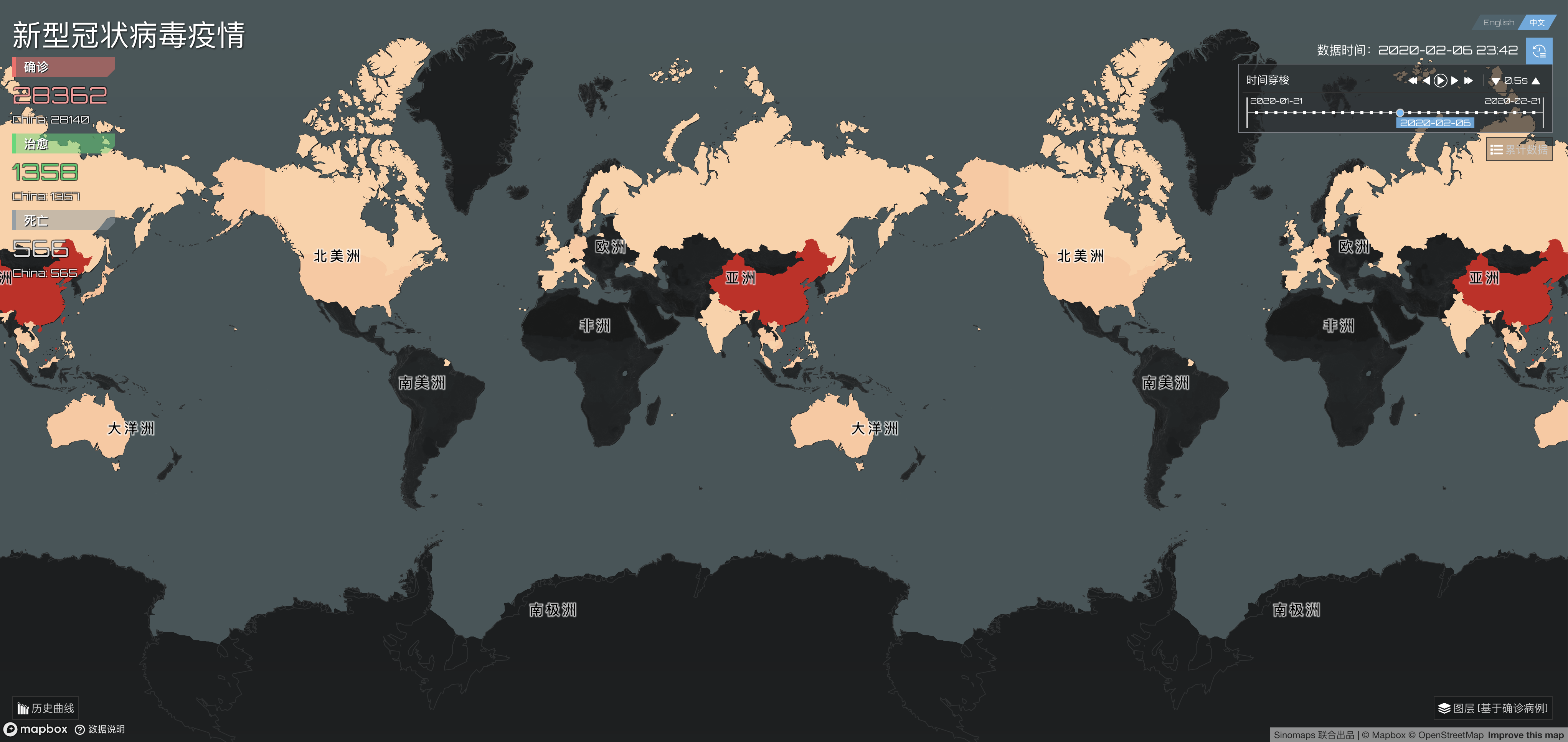
World level Epidemic Map
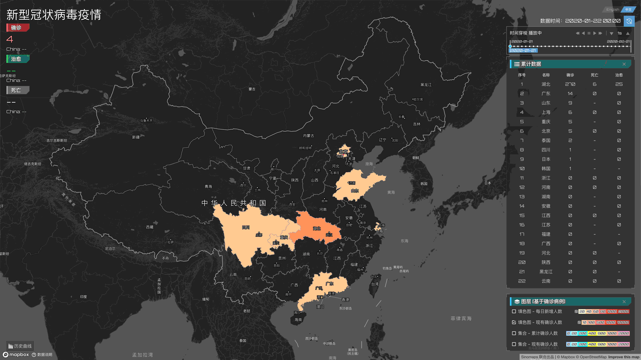
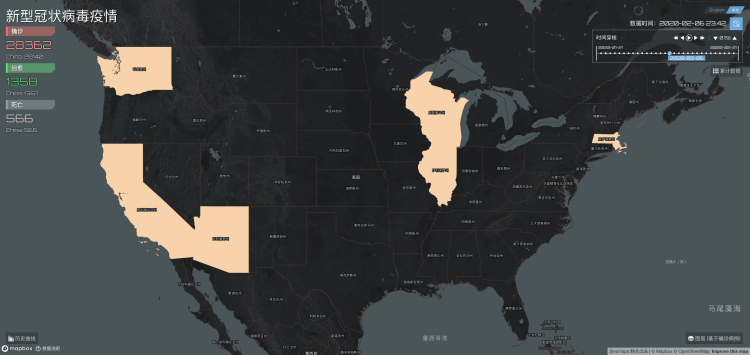
Provincial / State level outbreak map
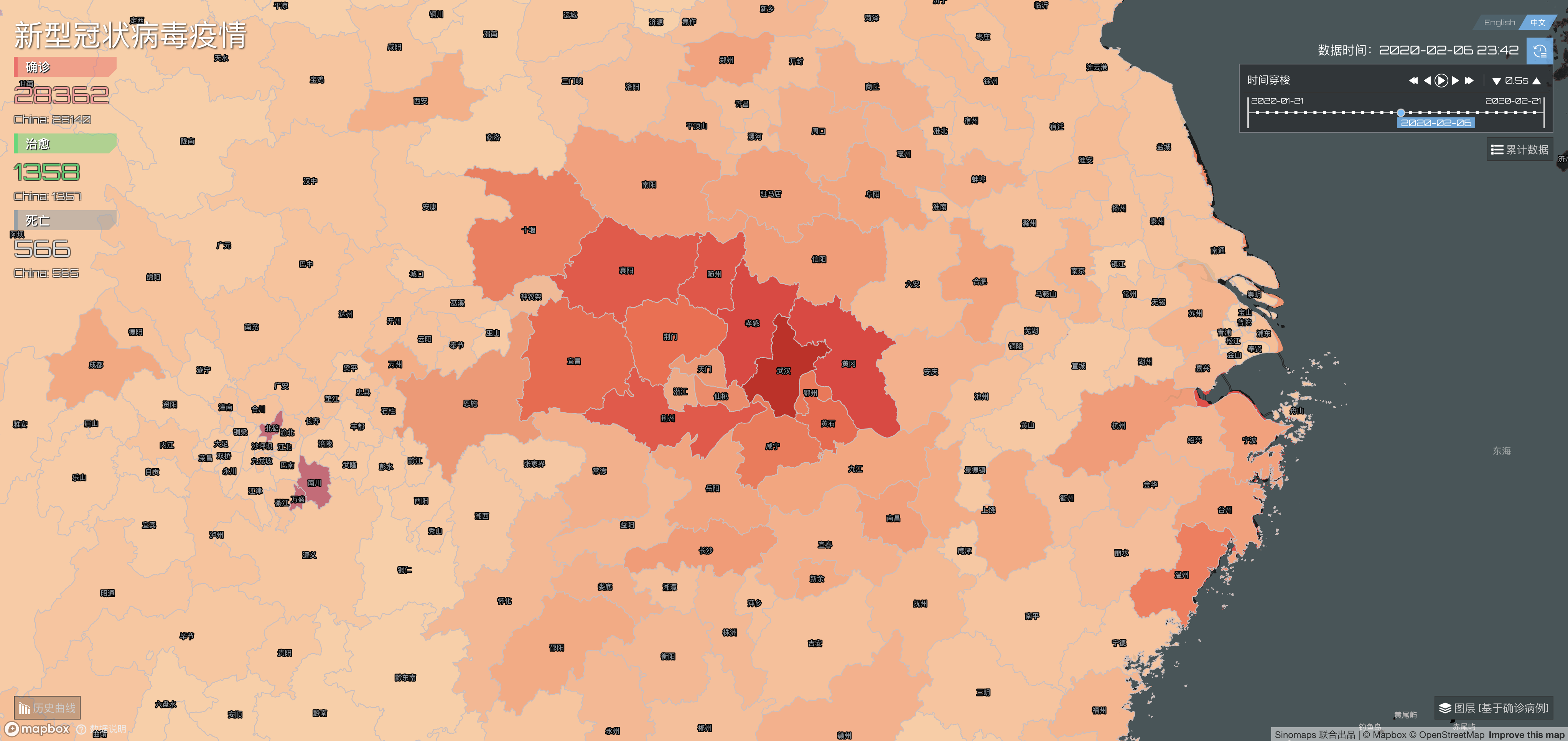
City level outbreak map
After the map was published, many friends asked me how we can achieve different coloring in different countries, because in some map SDKs, although custom color matching can be supported, it can only target all the same elements (such as all country, all provinces) which the same color, you cannot individually adjust the color matching for each country or city. In fact, in Mapbox maps, for the detailed data, we can upload polygon data such as countries, provinces, continents, cities in Studio, and then use this data layer in Style, or use our commercial boundary data. And for rendering, our GL JS SDK supports the function of color matching according to the data in the tiles. In Mapbox, we call it Expression. The expression is compelling. We only need to modify the Style JSON file to control the colors of different countries easily. For example, if there is a layer representing the city in Style, we only need to define his fill.
[
    "match",
    ["get", "name"],
    "Wuhan", "red",
    "Shanghai", "rgba (255,255, 255, 0.0)",
    "United States", "rgba (255,255, 0, 0.0)"
]
When rendering, it will render according to the above rules.
You can even use the fields in the tile data directly. For example, our attributes about the country in the tile are as follows:
{
    "osm_id": 424314830,
    "name_en": "Russia",
    "type": "country",
    "abbr": "RU",
    "name": "Russia",
}
If we need to display the country name in English, changed the text-field field of the country name in Style from the default Chinese {name} to {name_en}. Express also supports various calculations, conditions, and Statements, etc. Open your mind, assuming you have a problematic needs. You need to display the country names of countries other than China as their country abbreviations plus the last four digits of osm_id (ie, for the above The data needs to show Russia_4830). This requirement is very complicated. We need to determine whether the country is China or not, and we need to take the osm_id of other countries for mathematical calculations, and then convert it into a string and the abbreviation abbr of the country. But what I want to tell you is that with Mapbox's Expression, you can do all this in one sentence, isn't it great! Specific, you can refer to the link provided later.
Reference link:
- Mapbox Expression https://docs.mapbox.com/help/glossary/expression/
Cluster Layer
The cluster layer is also a good data display scheme. It is straightforward. The specific values of a region can be clearly expressed through circles of different sizes and colors. It is simple but effective.
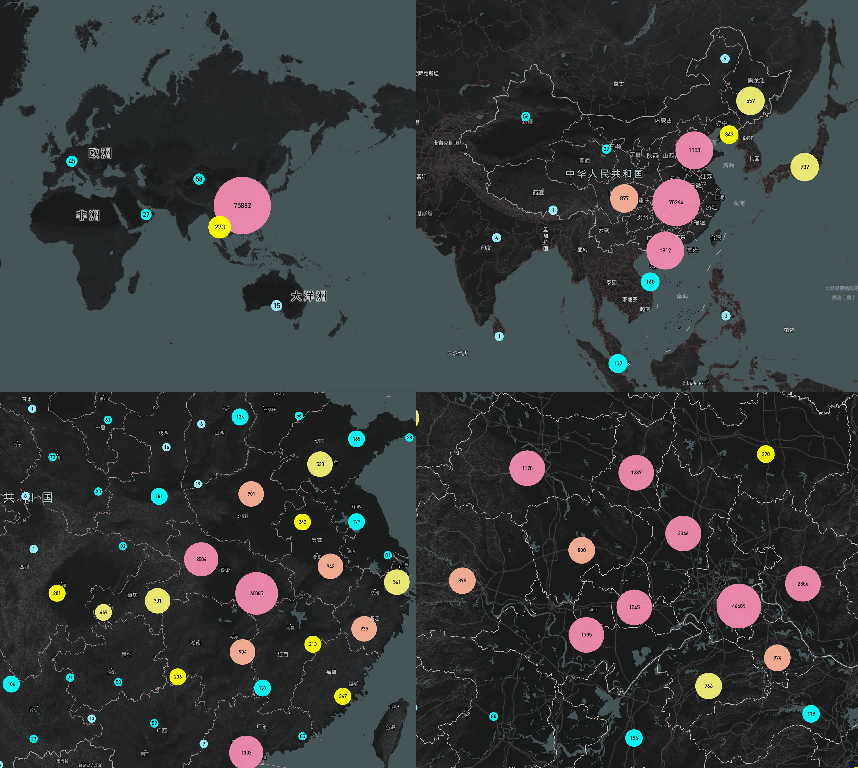
It can be seen from the picture that when we zoom in the map to a certain level, such as the national level, we will aggregate and display the values of the country area. Readers can spend two minutes thinking about what needs to be done if these functions are manually implemented? In most cases, we need to manually calculate the aggregated data at different zoom levels, and then display it. However, our data in Mapbox has a very magic cluster parameter. Open it to achieve automatic aggregation of data through a single line of code. You can also adjust the size of the collection. For example, I want to set all points in the range of 20px. All are aggregated and displayed, just specify clusterRadius as 50.
Also, the circles of different sizes and colors on the map can also be directly implemented through Mapbox's official circle layer. For details, refer to the subsequent reference links.
Reference link:
Mapbox Sources Cluster https://docs.mapbox.com/mapbox-gl-js/style-spec/sources/#geojson-cluster
Mapbox circle Layer https://docs.mapbox.com/mapbox-gl-js/style-spec/layers/#circle
The following is the sample code similar to the rendering in the official Mapbox example:
- Create and style clusters Demo https://docs.mapbox.com/mapbox-gl-js/example/cluster/
Category Layer
With the heatmap layer, color fill layer, and cluster map layer, we can very well see the spread of the epidemic and the severity of local areas, but can we see the healing process of local outbreaks? We introduced the concept of a classification chart, which is also one of our favorite data representations. It looks like a colored ring, represented by a circle of indefinite radius and a ring of different colors on the outside.
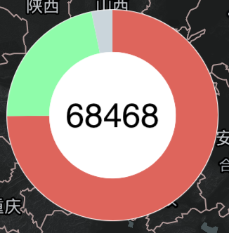
The radius of the circle varies according to the size of the center value. The red, green, and gray parts of the outer ring represent the number of diagnoses, cures, and deaths. The center value is the sum of these types of values. Through this classification chart, we can see at a glance the current state of the epidemic cure rate and mortality. We will observe that the green part will become more and more, and the red area will gradually decrease, indicating that we have taken strong measures. At the same time, if we put together the classification maps of different provinces, countries, and other regions, we can see the difficulty of curing the epidemic in different places.
分类图制作起来相对麻烦,和聚合图一样我们要根据不同的缩放级别进行对数据聚合,然后针对每一个圆环,我们要计算出不同类型的数值相对总数的百分比,然后再转换成角度进行绘制。该例中我们使用了Mapbox的自定义图标功能结合SVG去绘制四周的环,在Mapbox官网上也有一个类似的示例可供查看。另外由于每个圆环都是由SVG组成的,对于海量的数据可能存在性能问题,我们建议如果你的数据过于庞大可以把SVG换成基于WebGL的实现来完成。
The category layer is relatively troublesome to make. As with the cluster layer, we have to aggregate the data according to different zoom levels. Then for each ring, we have to calculate the percentage of different types of values relative to the total number and then convert it into angles to draw. In this example, we used Mapbox's custom icon function combined with SVG to draw the surrounding rings. There is also a similar example on the Mapbox official website for viewing. Besides, since each ring is composed of SVG, there may be performance problems for massive data. We recommend that if you have big data, you can replace SVG with a WebGL-based implementation to complete it.
Related Links:
- Display HTML clusters with custom properties https://docs.mapbox.com/mapbox-gl-js/example/cluster-html/
Metamorphosis - Multidimensional Attack
After animated the data, we can feel the seriousness of the rapid spread of the virus, but can we make a more meaningful analysis with the daily statistics? Of course, we can! We can discuss two dimensions, among many dimensions, as an example.
Dimension One: Daily Additions
Now that we have the number of people diagnosed daily if we try to subtract the number of people from the previous day, wouldn't we have the number of people added each day?
Let's Do it!
We have added a daily increase layer, and feel the daily heat maps:
This is an accelerated data. The red area indicates the place where more than 100 people are added daily. What do you see from it? Can you feel the rapid outbreak in the early stage of the epidemic and the epidemic being controlled well with the implementation of powerful measures in the later stage? If you want, you can see the characteristics of the outbreak area. You can also find the area of the abnormal outbreak, etc. This information may be of particular value in some occasions.
Dimension Two: Number of existing patients
The number of confirmed patients can also be easily calculated by a mathematical formula. existing patients = the cumulative number of diagnoses - cumulative number of cures - cumulative number of deaths. Different from the traditional cumulative map, using this kind of map can let people have a more macroscopic understanding of the outbreak and retreat of the epidemic. If you carefully observe the last few frames of the heat map below, you can see that the epidemic situation has a clear tendency to recede.
Sum up
Map and data visualization is an interesting topic. With the help of visualization, we can more intuitively observe the characteristics of the data. A good visualization can even support our important decisions at some times. Finally, it should be stated that all the data in the above cases are collected from authoritative institutions, media, and networks. Analysis and interpretation of the data do not represent official opinions. In case of conflict, the official announcement shall prevail. Pay tribute to the heroes on the front line of anti-epidemic, hoping that the epidemic will end soon. At this moment, we "quietly" wait for the epidemic to dissipate. When the spring flowers bloom, take off the masks and go to the streets with friends and relatives to share the good life.